
By combining a large interactive screen with tangible inputs (pens and disks), Coalign transforms fragmented feedback and abstract discussions into a hands-on, real-time collaborative experience aligned with Agile workflows.
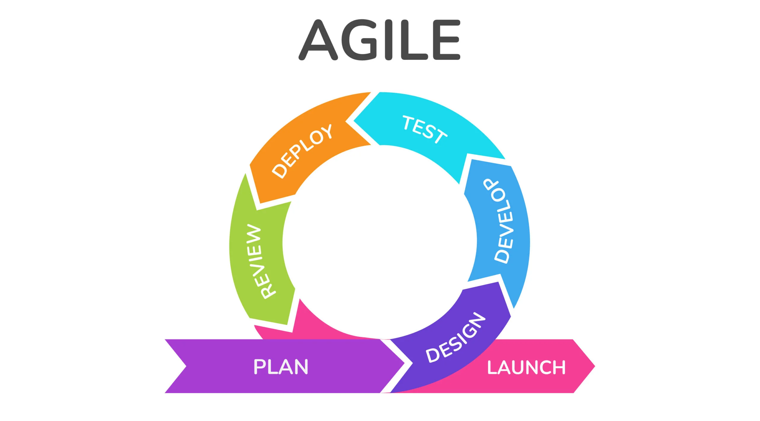
Our team focused on a challenge that all product teams face. Every week there are meetings and milestones to meet and the most difficult part is communicating and getting changes processed thought the team. It is so time consuming to collaboratively critique, refine, and understand on the best decisions across design, product, and engineering teams. Feedback is scattered across tools, decisions get lost in threads, and design variations are hard to track and follow through. The Agile workflow is all about working fast and small teams want the fastest, most efficient way to work fast.
Enable a faster, clearer collaboration during design critiques and sprint meetings
Support multiple roles (Designer, developer, manager) in a single system
Bridge ideation -> critique -> execution within one workflow
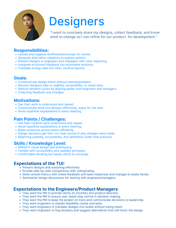
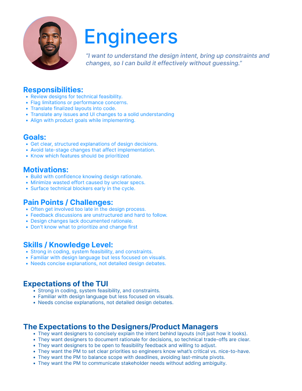
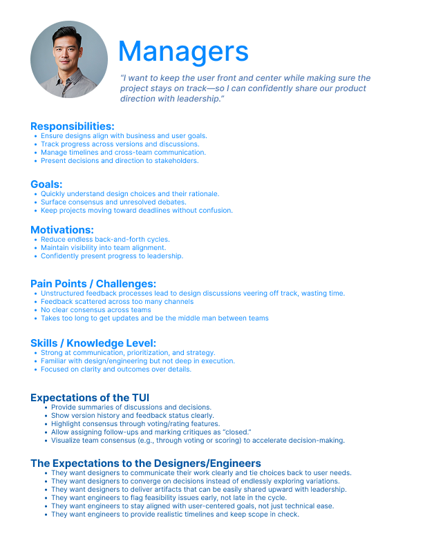
Our designs were heavily impacted by these archetypes because we needed to be building for three groups of people falling under different job categories. We needed to understand what each of these users wold gain and need from our interface.
Our solutions circled around the ideas of allowing the already existing Agile workflow to be reached better.
1. First, designers will present new design features or products that need to be critiqued and built.
2. Next, teams will understand and give feedback, or even brainstorm and make real-time changes to designs
3. Then, developers review the updated designs and understand the technical requirements and feasibility. Break it down and understand what needs to be done (what data needs to be accessed, how long will this take?)
4. Finally, the tool will end the meeting documenting the feedback, tracking changes, and assigning tasks to specific people, and the manager can edit and iterate on milestones and tasks.
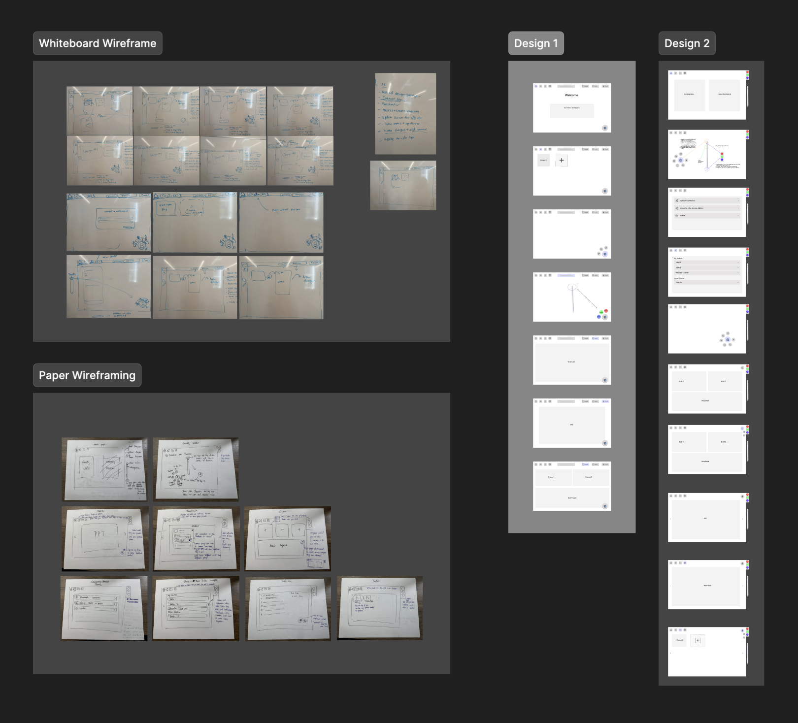
After sketching out this prototype and receiving feedback, we understood that there had to be more options and collateral for the other types of users. Even though designers have the most agency, there needed to be more choices and ways that other users could interact with our TUI.
Non-designers lacked clear ways to participate, indicating a need for more inclusive interactin options.
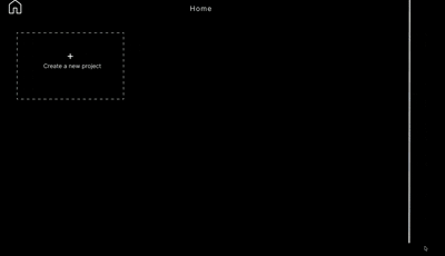
"So I think cursor by default it does not have any option for me to create a project."
"And even page for me to create a new project, it’s only allow me to open file open project."
To evaluate the clarity, accessibility, and onboarding effectiveness of the redesigned Cursor experience, we conducted moderated usability interviews. These sessions allowed us to observe real-time behavior, probe user expectations, and uncover friction points that would not surface through unmoderated testing alone.
Older and less experienced users struggled with text size and contrast.
Users expected an in-product help hub with documentation, FAQs, and search.
Several participants did not understand what Cursor was before onboarding.
This project highlighted how tangible interfaces are especially impactful in group settings. By enabling multiple users to interact physically and simultaneously, the system encouraged discussion, shared understanding, and real-time decision-making. The physicality lowered barriers to participation and made abstract concepts easier to externalize, organize, and negotiate collaboratively.
Tangible interfaces are most effective in group settings, where shared physical interaction supports communication, idea exchange, and real-time decision-making.
A key takeaway was the importance of storytelling and “show, not tell” design. Even with a strong concept, users struggled when interactions were not immediately legible. Clear setup, visual cues, and microinteractions proved essential for communicating intent and guiding use—demonstrating that how a system is presented can be just as important as what it does.